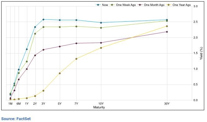
It looks like the Great Plains out there. It’s official – the yield curve is flat. Simply put – the rate of change in short term rates has been higher than the rate of change for the longer term rates, causing a flat yield curve. But why is it flat and what does it mean for your portfolio?
First – a quick reminder on Fed policy. The Fed is operating under a dual mandate: “promote effectively the goals of maximum employment, stable prices, and moderate long term interest rates”.
How are they doing and how does this impact your investment strategy?
Stable Prices
The Fed is playing catch up. Pre-pandemic it was a struggle for the U.S. economy to maintain consistent inflation readings near 2%. Technological advances and a relatively strong dollar are two of the driving forces for why inflation had been so low here stateside.
In August 2020, Chairman Powell laid out a plan to allow inflation to run higher than the standard 2% target before hiking interest rates. This implied that Fed target for inflation was actually above 2% in the short run so that we approach longer term averages of 2%. Once inflation readings popped, the word “transitory” entered the picture. I know – we don’t want to bore you with the math and rhetoric of this – but this is how we got here. As the economy began to reopen – the Fed remained very cautious about raising rates too early – to avoid the dreaded “policy mistake” of tightening money supply before the economy proved resilient.
Fast forwarded to today – inflation prints are at multi decade highs – north of 7% – and there is a new battle at hand for the Fed: stop inflation at all costs. Chairman Powell thankfully does understand the devastating impact of inflation on middle- and lower-income individuals, and we are on a path of raising short term interest rates for the first time since 2018.
Employment
In addition to the inflation change, the Fed shifted its approach to employment in a way that will focus on those at the lower end of the income spectrum.
Pre-pandemic 2019 – unemployment rates were below 4%.
Today – in late March 2022 – unemployment rates are again below 4%.
The Fed has more than achieved their objective – though some would argue they have less direct influence on this area of the economy. This chart below shows Unemployment Rate back to late 1940s. After WWII – unemployment raced to sub 3% before the recession in 1953 and 1954. And we have repeated this pattern, to varying degrees many times in our nation’s recent history.
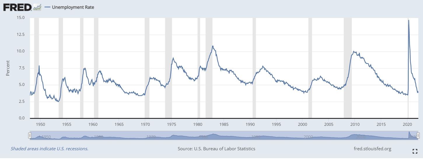
There are a lot of comparisons to the Roaring 20s (1920s) post Great Depression, post WWII when workers returned, the inflationary times of the 70s, and the Cold War era through the 80s. We won’t break down each of those comparisons today.
What we do know:
• Unemployment is at record low levels again (Positive)
• The US Treasury yield curve is flat (Caution)
• Recessions follow extreme periods of full employment (Caution)
• Energy and Food prices are high (Negative)
• US Consumer is currently strong (Positive)
• Higher interest rates mean future cash flows of companies are more discounted in the eyes of investors.
At Sugarloaf, in this environment, we continue to believe having less exposure to bonds is a prudent investment strategy. The chances of out earning inflation by purchasing high quality credit is very low.
We also believe in ‘drawdown patrol’. Knowing bonds may not be the save haven we want them to be, stocks must carry more weight. Hedging extreme downside risks becomes very important.
Why does all this matter? We want you to succeed – we want you to reach your financial goals – and we want to help you stay invested. Timing the market is a losing game – and we want you to win!